Hey,
>> spencerone[at]openmailbox.org:
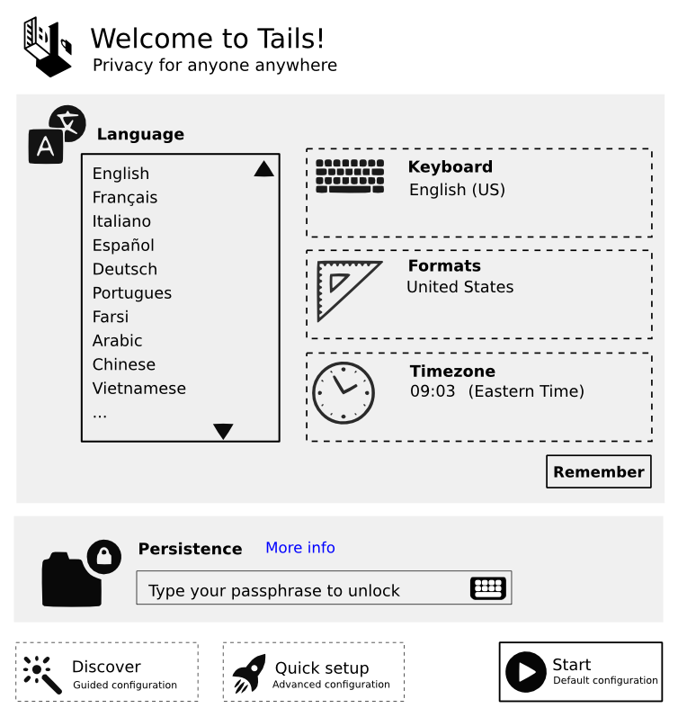
>> Attached is a visual exploration of what the Check & Go greeter screen
>> could look like. It explores the Advanced Configuration flow upon
>> edit,
>> as the Basic Configuration [Walkthrough] flow is self explanatory with
>> each step isolated on its own individual screen.
>>
>> In short, it attempts to consolidate as much of the existing flow
>> fragmentation as possible. There is a more detailed explanation on
>> the
>> document itself.
>>
>> I hope it addresses the existing decisions as you intended, if not, we
>> can figure it out together :)
>>
> sajolida@???:
> Thanks for working on this. I'll comment on your proposal based on
> actual tickets that we have to solve.
>
No worries :) Thanks for being so inviting!
>
> #8968: Redesign the "language" section
>
> I like the simpler way of displaying all the language options one of
> top
> of each other as this would solve #8968. Still, I would have those
> options directly editable (without having to click "Edit"). You might
> have argued in favor of that choice later in the thread, though.
>
Direct editability would be most appropriate if all of the options were
visible, including the more technical options, then there would be no
fragmentation of the configuration flow. However, I understand and
respect the desire to accommodate different use cases and the varrying
technical understanding of people by having two seperate configuration
flows. Having two paths requires a decision, though, and an 'Edit'
button is an effective way of addressing this.
>
> #8976: Consider merging "basic" and "advanced" screens
>
> I'm not convinced by the idea of displaying the advanced options on the
> first screen. And for several reasons:
>
> - It adds more information than need to newcomers, while we are
> working hard to make the default options not harmful in the general
> case. So with your proposal, someone new to Tails would be faced with
> jargon such as "Mac Spoofing" with as much importance as "Keyboard
> Language".
>
It does add more information for beginners, but, as in the existing
blueprint for 'Context' in the 'Guided Configuration' flow, what is
being called jargon is already present as subtext, in this case, as the
actual description to labels like 'Home & Office'. It also appears in
'Check & Go' in the same flow, in addition to other more technical
options.
Considering this, and in addition to the more technical options
displayed in 'Check & Go' [the last screen in the 'Guided Configuration'
flow] it seems appropriate to provide a more comprehensive view of the
configuration settings by including 'Language' on the same screen.
>
> - Advanced options might grow bigger in the future, and we might then
> have problems showing everything on a single screen. Having a dedicated
> screen for "Advanced" options would be less problematic to this regard.
>
No problem. All content can be accommodated for. It would be less work
to know what they all are as early in the game as possible. Is there an
exhaustive list of these settings, maybe with cited likeleyhoods of
inclusion?
>
> A solution to both problems could be to rely on "tabs" or "views" as we
> proposed with Alan on
> https://labs.riseup.net/code/attachments/download/652/greeter2.png.
>
I am not a fan of tabs, though that could address space issues. Having
an expandable 'Advanced' section below the language settings feels more
appropriate and less fragmented.
>
> Still, I'm conscious that this might be antagonist to the idea of #8974
> (Feedback to the user which options are going to be used). But then
> maybe we don't have to push that information to the user if she doesn't
> diverge from the default settings.
>
The most occourent use case is 'Start Tails with Default or Advanced
Settings'. This is of course overlooking the issues you raise with
saving/remembering the more technical settings.
I firmly believe that designers, which we all are, are teaching others
how to learn by creating interfaces that allow people to teach
themselves. With this said, it seems appropriate to educate people of
varying technical levels of understanding what options are available to
them and what importance these options hold in regard to the intended
funtion. In our situation, this is most effectively accomplished by
displaying everything upfront with the most agreed upon settings as
default, whilst also allowing direct editability and persistence of
these settings if one so desired. I addition, if editability and
persistence of these settings is pursued, given the two end-of-spectrum
use cases we have been accommodating, it seems only fit that there is a
guided and unguided path that can be taken. This is where the edit
button with two paths, 'Basic Configuration' and 'Advanced
Configuration', comes in, though they can alternatively be referred
to/labeled as 'Guided Configuration' and 'Unguided Configuration'.
>
> #9004: Reword the "remember" options for language settings
>
> I'm worried by the fact that you placed the "Save" button below all the
> other settings. The idea here is the allow for saving the language
> options only (as all the other ones might have privacy implications).
> Remember that our last consensus had it as part of the "Language"
> section. See
> https://tails.boum.org/blueprint/greeter_revamp_UI/greeter-1st-screen.png.
> But still, apparently this has to be improved upon, so let's keep this
> in mind.
>
Can you expand upon the privacy implications of saving all other
settings for future sessions, or point to a thread that already has?
What are the specfic issues and how do they differ from those presumably
present with saving language settings and having encrypted storage?
Knowing this will help me provide a more valuable and productive
response.
>
> #8244: Decide if we want to keep the wording "Quick setup"
>
> I'm all for the wording "Basic" and "Advanced" which we have been using
> in that thread. But I think that making it clear that some options are
> "basic" and some are "advanced" is a way to keep the information load
> lower for newcomers. When #8976 says 'Consider merging "basic" and
> "advanced" screens', I think that we should work on having both sets of
> options accessible without having to through a sequence (like our
> latest
> consensus does) but not by making them all visible all the time.
>
The cognitive information load can be low while the experiential
information load is high, examples of this are cluttered interfaces and
fragmented flows. I think that people want to know how they are being
secured, especially if they are using Tails, and in as simple of a way
as possible. This is opposed to being treated as simple by having this
very important information hidden behind the label of "Advanced".
>
> #8776: Rename "Start" button as "Start Tails"
>
> I see that you are in favor of "Start Tails". I'm all for it as well.
>
Start Tails :) Though I understand and respect the use of icons for the
sections, such as 'Language', I would push for no iconography for 'Start
Tails'. What do you all think?
Wordlife,
Spencer


